Designing and developing a dynamic website for a home appliance manufacturing business to create a cohesive brand identity and show diversity in its product range.
Understanding the client’s goals and characteristics of the target audience.
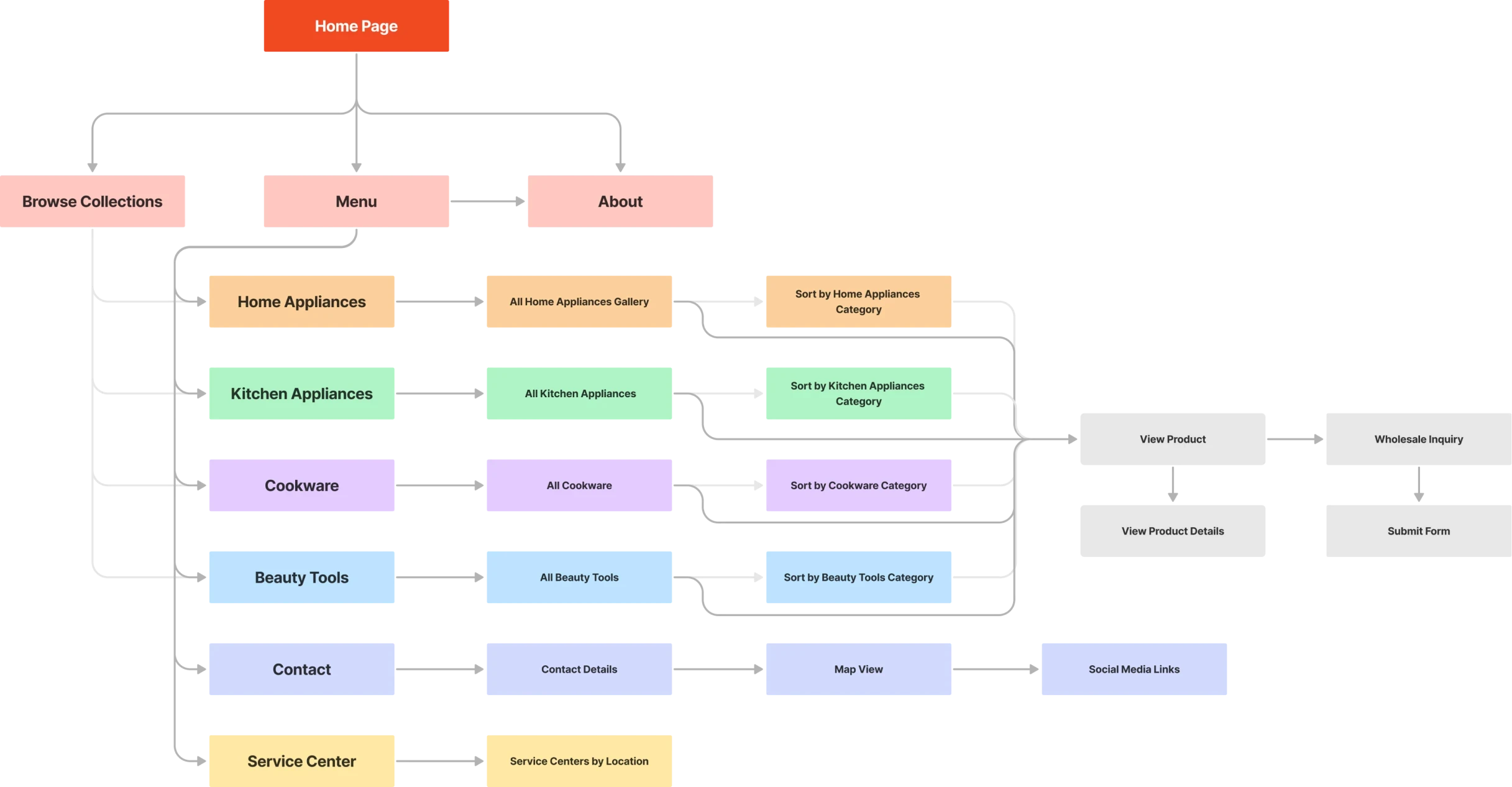
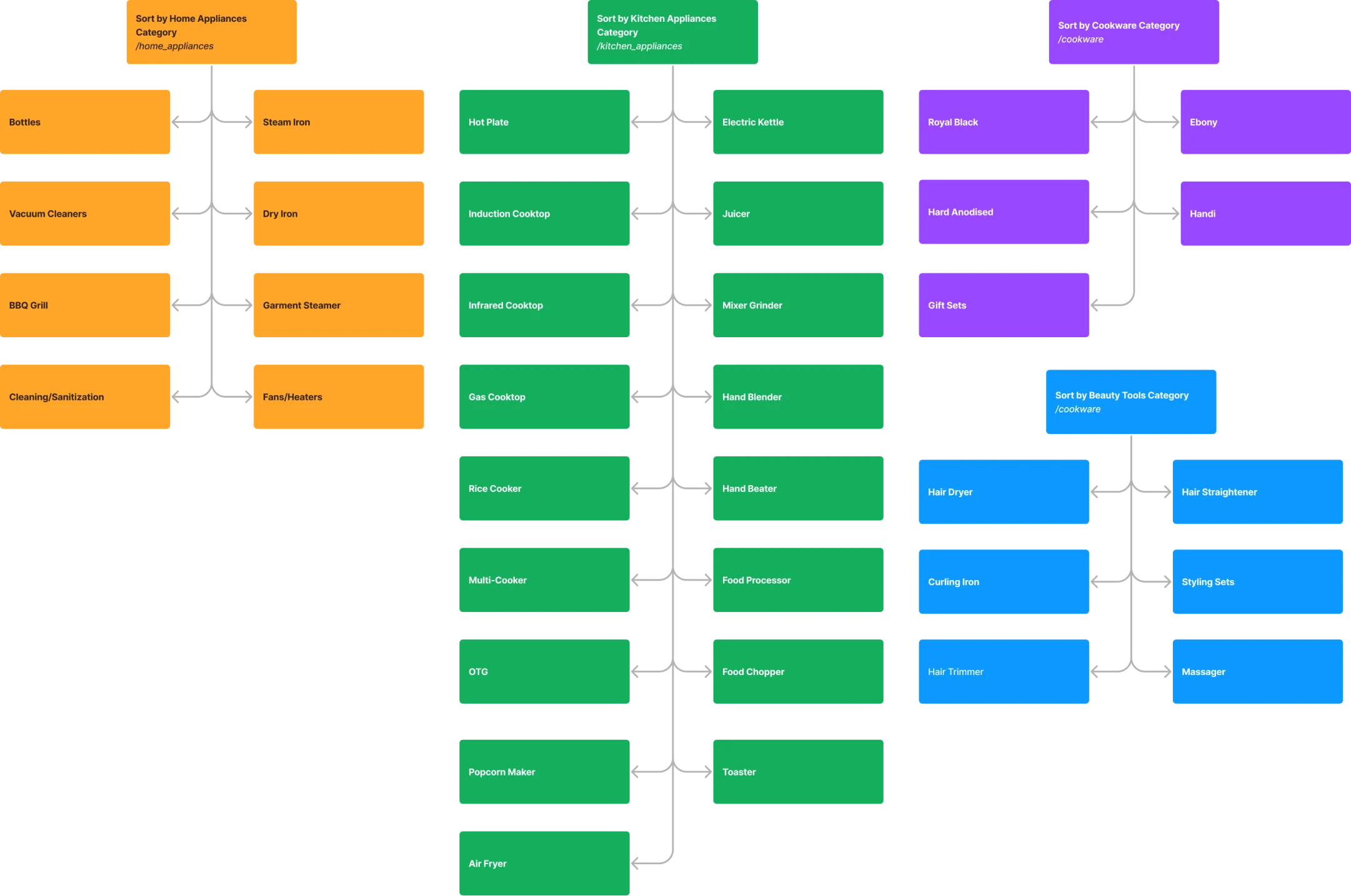
Creating a robust information architecture to categorize 350+ products according to the user’s mental model.
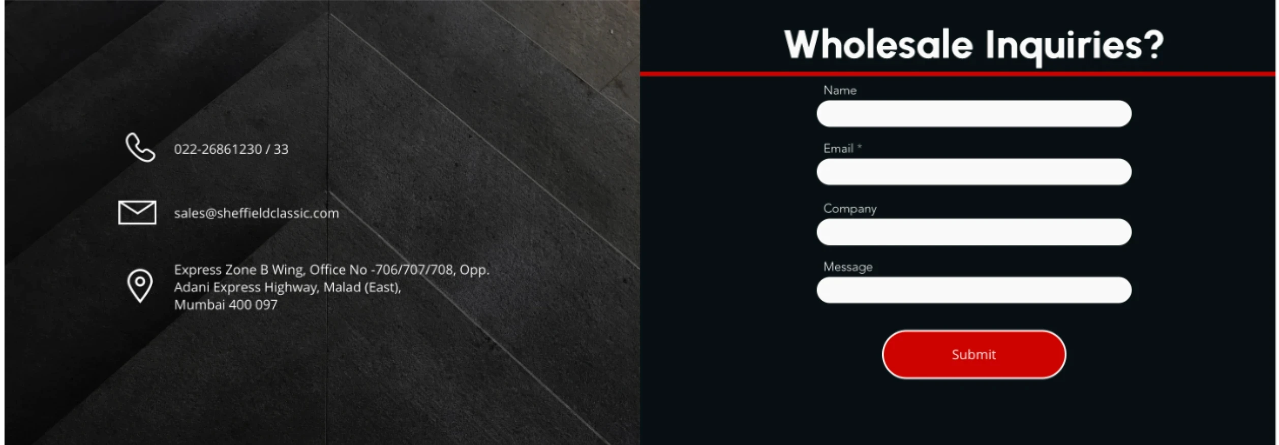
Designing wholesale-focused features and a visual identity that aligns with the brand's vision.
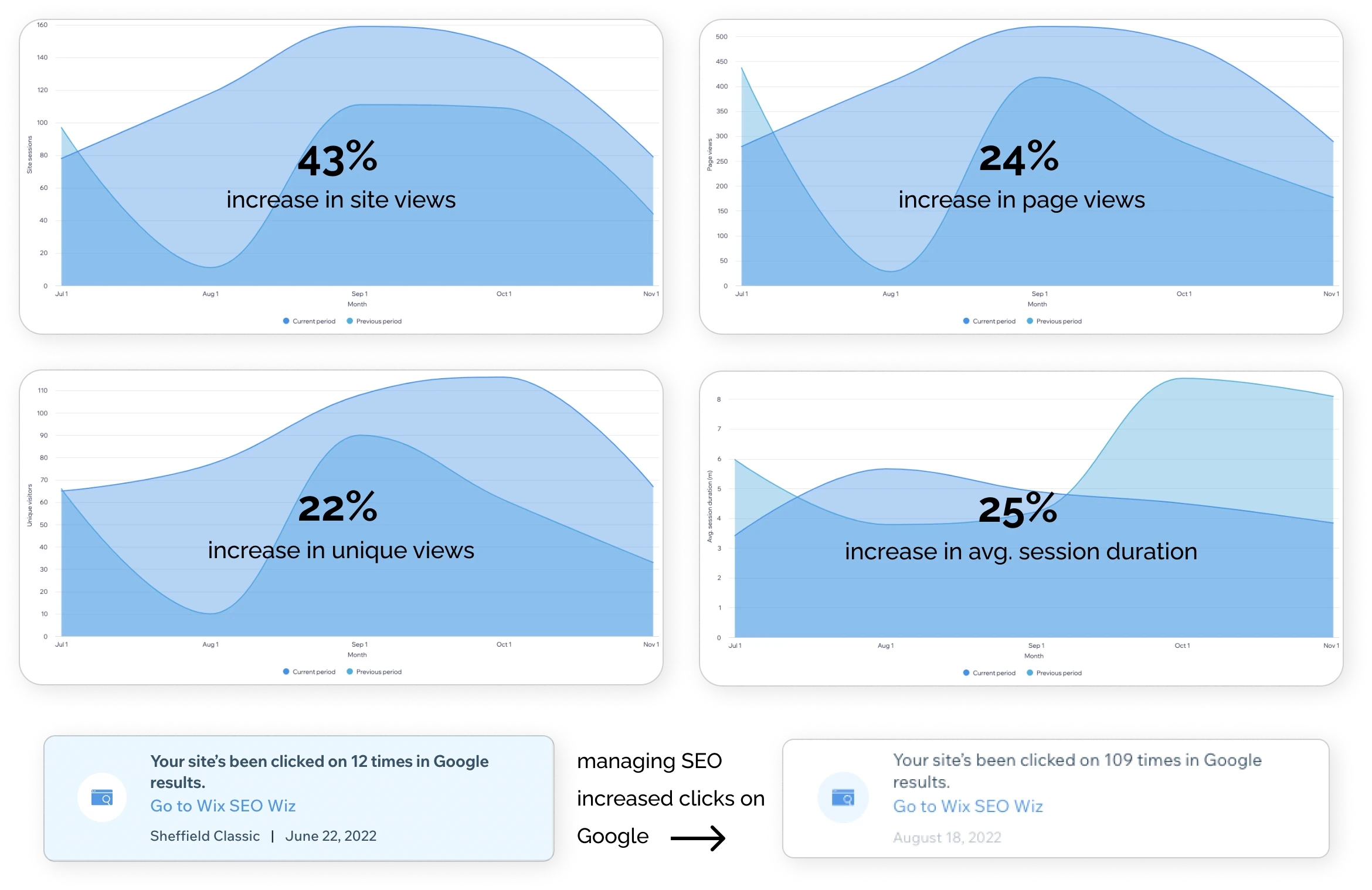
Developing a website to host the website and manage the SEO to increase site visits by 43%
sales team
management team
Challenge.
Sheffield Classic is $12 million manufacturing client and a popular name in the Indian household appliances industry. They are known for their quality, price, and range of products. Their clients range from popular commercial brands like Croma, Bajaj, and Inalsa to businesses like hotels and canteens.
They are looking to expand their web presence and get more involved in the B2C sector on the side. Based on the initial client interview we also identified an additional goal of understanding the needs of the sales team, marketing team and the target audience - the external clients.
Revamping the website with a renewed information architecture and extending its existing visual identity to highlight the brand’s competitive advantage
IDENTIFYING 3 Main PAIN POINTS IN THE CURRENT WEBSITE
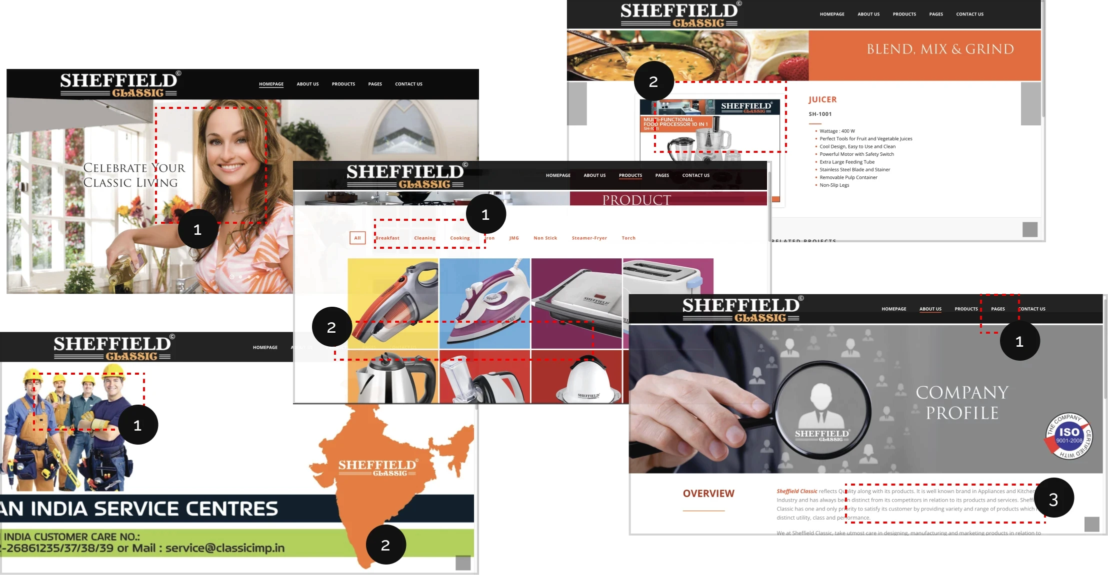
On analyzing the current website, I noticed that the website was very static and didn't align with the brand's vision.

Disconnect between target customers
and the website

Playful and Vibrant look
for a sleek elegant brand

Old information
with no call-to-action
Approach.
Focusing on Information Architecture and User Experience
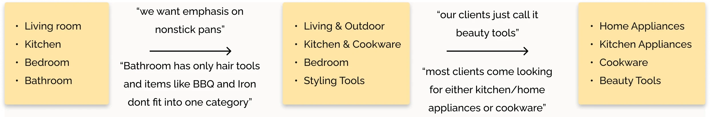
mapping 350+ PRODUCTS to the CLIENT'S mental model
To create 4-5 categories that fit the stakeholder's mental map, I initially created categories using spaces where the products were used in. I quickly realized that the most efficient way to test and get an accurate mental model is by talking to the sales reps that work directly with the businesses. Asking “What are the common buzzwords you use for your clients to describe the product?” - led to the final Information Architecture.
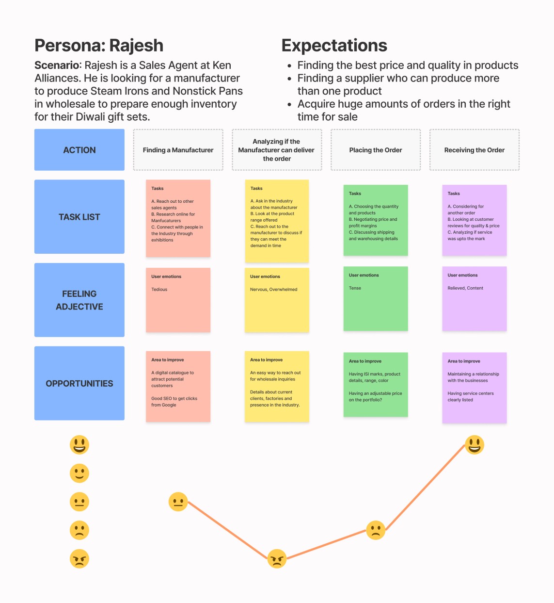
journey of an external client
After studying the references provided by the client, I analyzed the technical proficiency and mental map of the target users. I also created a journey map for sales agents to understand how the website can cater to them. The opportunities section led to features that can accelerate the buying process.
CHANGE IN CLIENT'S BUSINESS GOAL
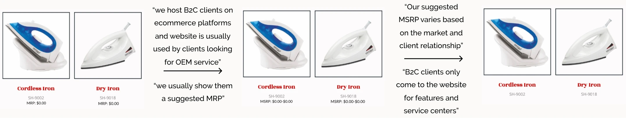
One of the major difficulties when designing the user experience was displaying the price. The client had initially agreed to provide a price list to display MRP for its B2C audience. But after the site was 70% developed, the client changed the price list to show the MSRP. Since Wix Stores handles prices differently, I would have to manually add prices to 350+ products delaying production. The client felt bad about the change requested and kept going back and forth. This prompted an important discussion.
Before completely scratching the database, I decided to meet with the client to understand the reason behind this change. Luckily the client welcomed this discussion where we delved deeper into what price to display. We ended up not displaying prices at all to allow for negotiations and adjustments in price over time. This meant I had to start from scratch and change the site's structure, adding more production time but the end result was more beneficial to the client.
preview of the final information architecture
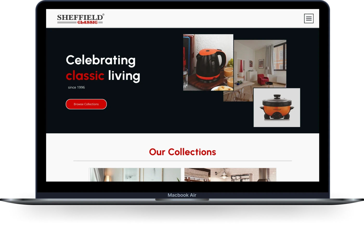
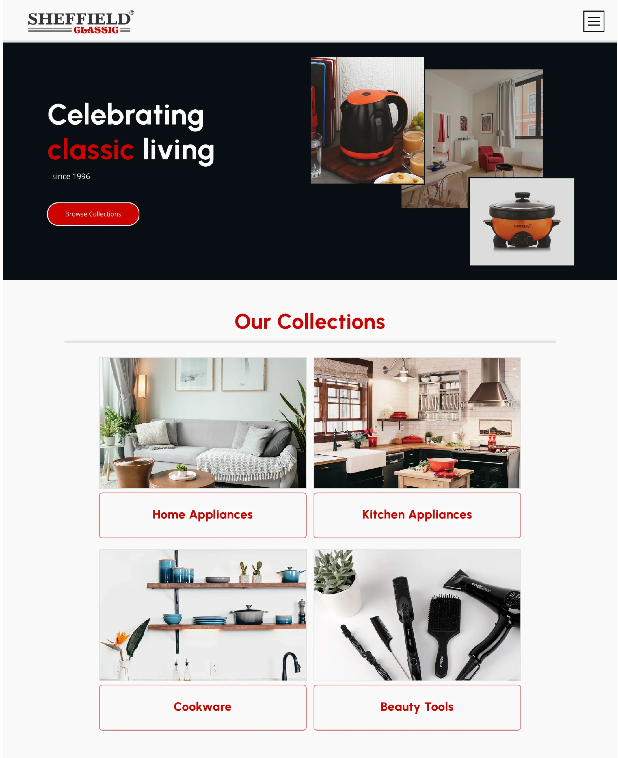
CREATING A TIMELESS & SLEEK FEEL
I decided to reduce the accent colors from the catalog to one - red. Since the product photography was done by different agents and had different moods, I choose to use a grey and red border treatment to bring consistency and eliminate the use of pure black and pure white.

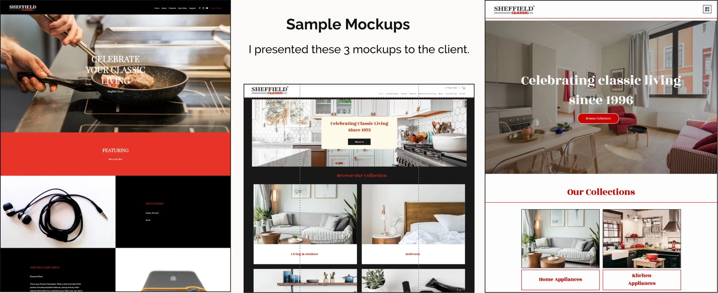
ITERATIONS
After the client selected the 3rd mockup, I made iterations to design and develop personalized features based on the site's performance and feedback. I updated all the written content and stock images to better target clients from multiple Indian regions and countries.


DEVELOPMENT
I used EditorX (a low-code web development tool) to design, develop and manage the website. I choose this since it allowed for an affordable price, easy offloading, and role assignment features to the clients while giving me the freedom to design. It also let me host a large database and potentially create a Wix Store which aligned with the client's needs. I used Velo to code personalized features like selection tags and infinite scroll. I also managed the site's SEO using Wix SEO tools.
Solution.
Streamlined and wholesale-focused buyer experience
The result of the above approach was a minimal user interface and a streamlined buyer experience that improves brand visibility and establishes trust. The classic and elegant visual design aligns with the brand’s message and highlights the diversity of products that the brand has to offer.
Using forms, phrases and architecture that represents buyer’s mental map helps in client conversion and empowers sales agents as well as international clients to trust the brand. The website led to highest brand visibility, business opportunities from international clients and highest sales orders for Diwali.
matching client's mental model with an new architecture and clean interface

IMPROVED BUYER EXPERIENCE WITH FILTERS & FORMS

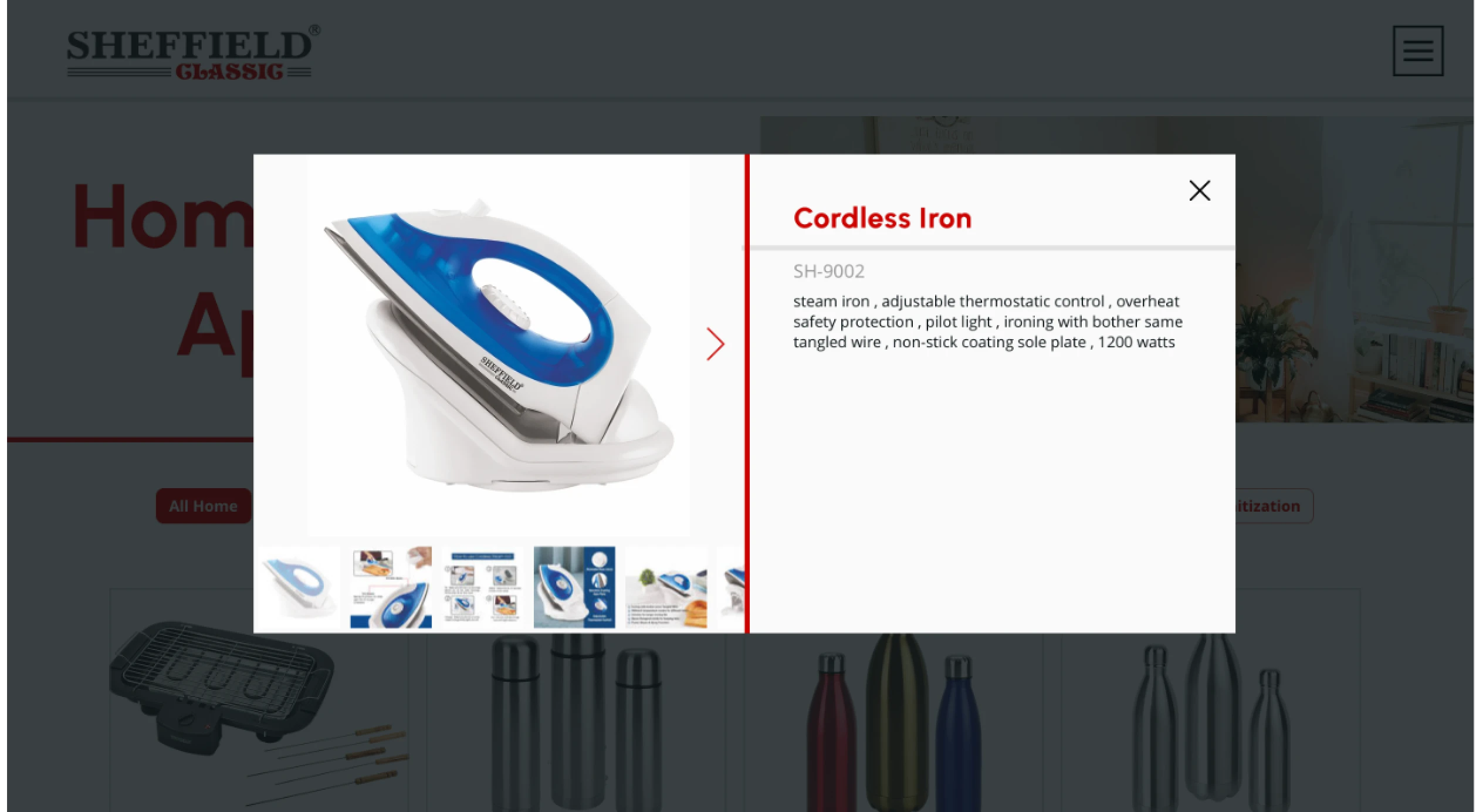
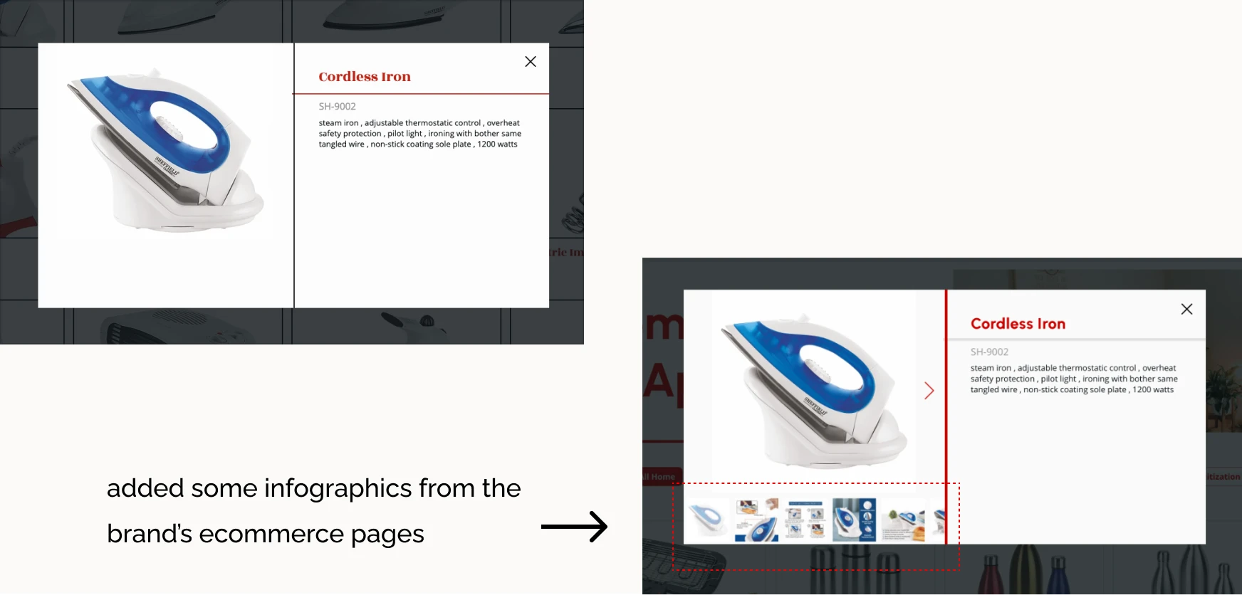
BUILDing TRUST AMONG CLIENTS with curated content

Results.
Numbers that show improvement in 5 months
Reflection.
Having never worked with a client in a B2B space with over 300 products, this was one of my ambitious projects as a solo designer and developer. My strategy for the project was to break it down based on information/database, design the feature to tackle that feature, get feedback, iterate, develop, and then make final iterations based on site performance. I also kept my designs intentional by grounding them in the customer journey especially focusing on pain points and opportunities. This helped me make decisions quickly without hand-holding from the client but still ensuring that I understand their business goals.
In retrospect…
I liked the ownership and freedom I got over my designs. I also liked that I could adapt to the client changing goals to a B2B-only website. However, in the future, I would advocate for choosing a specific use case for the website early on. This would equip me to better evaluate the technical constraints of the development tool.