Designing a peaceful freemium experience
for Calm meditation & sleep app
Challenge
Redesigning calm’s user interface to address users’ dissatisfaction and create a cohesive and peaceful user experience.
Solution
Addressing user complaints about the free version by replacing deceptive patterns with features that increase visibility.
Offering easy access to the main features and two modes of UI that support users’ dynamic needs.
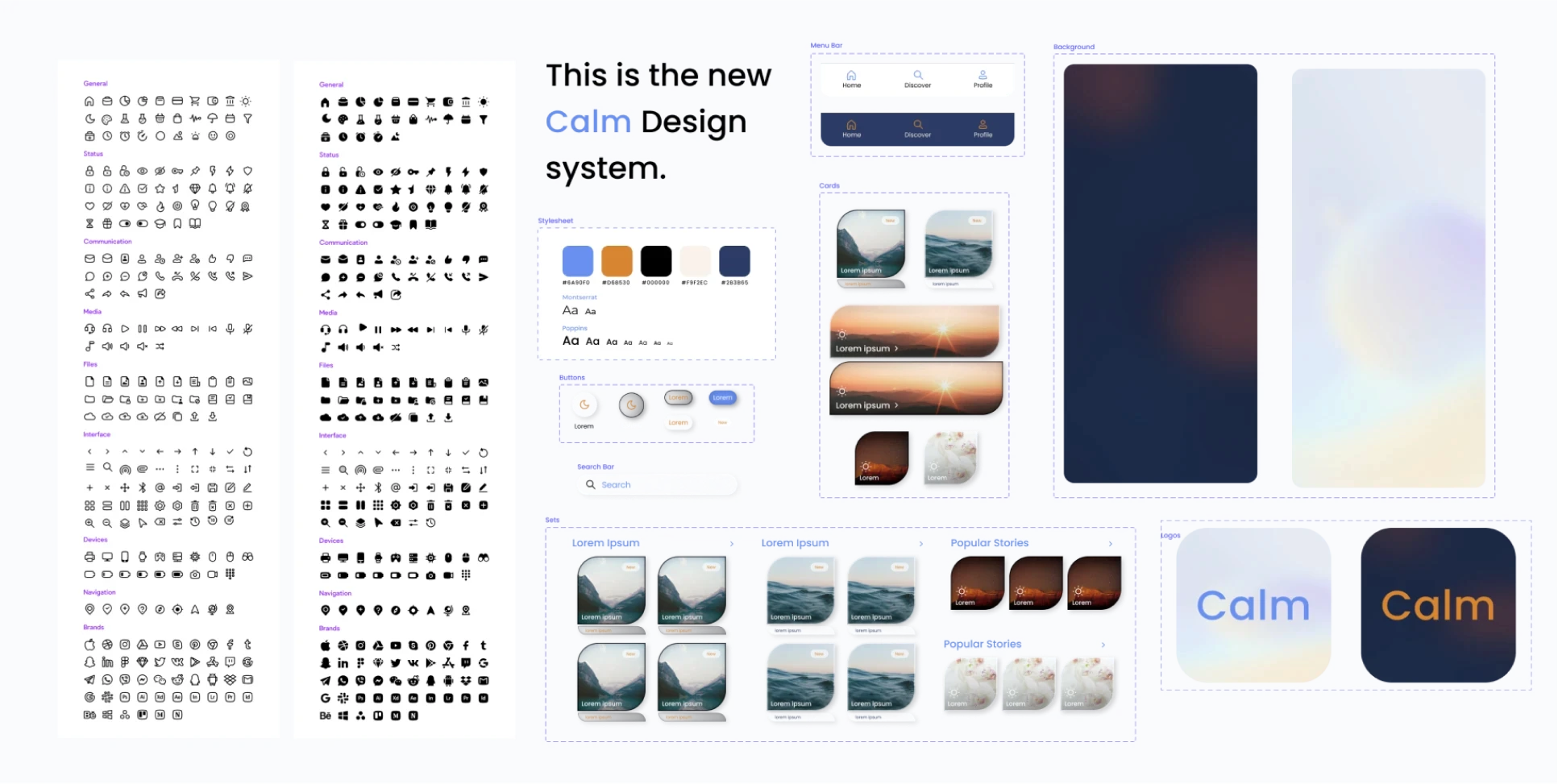
Designing a minimal user interface and a consistent design system that adds to the users' meditation and sleep experience.
Role
Visual Designer
Team
4 team critiques
15 final critiques
Time
2022, 2 Months
Tools
Figma, iPad
Challenge.
Calm is one of the top meditation and sleep application on the app store known for its wide variety of content. Its target audience is working adults in their early thirties. However, its recent redesign has its users frustrated. The users say the new design is overwhelming and confusing.

Re-designing the calm's browsing experience to address the frustrations of freemium users.
IDENTIFYING THE PROBLEMS IN THE INTERFACE
I noticed inconsistencies in the menus across different screens, archaic scenery, and hard-to-access features like check-ins. Additionally, the overall content layout was overwhelming and crowded.
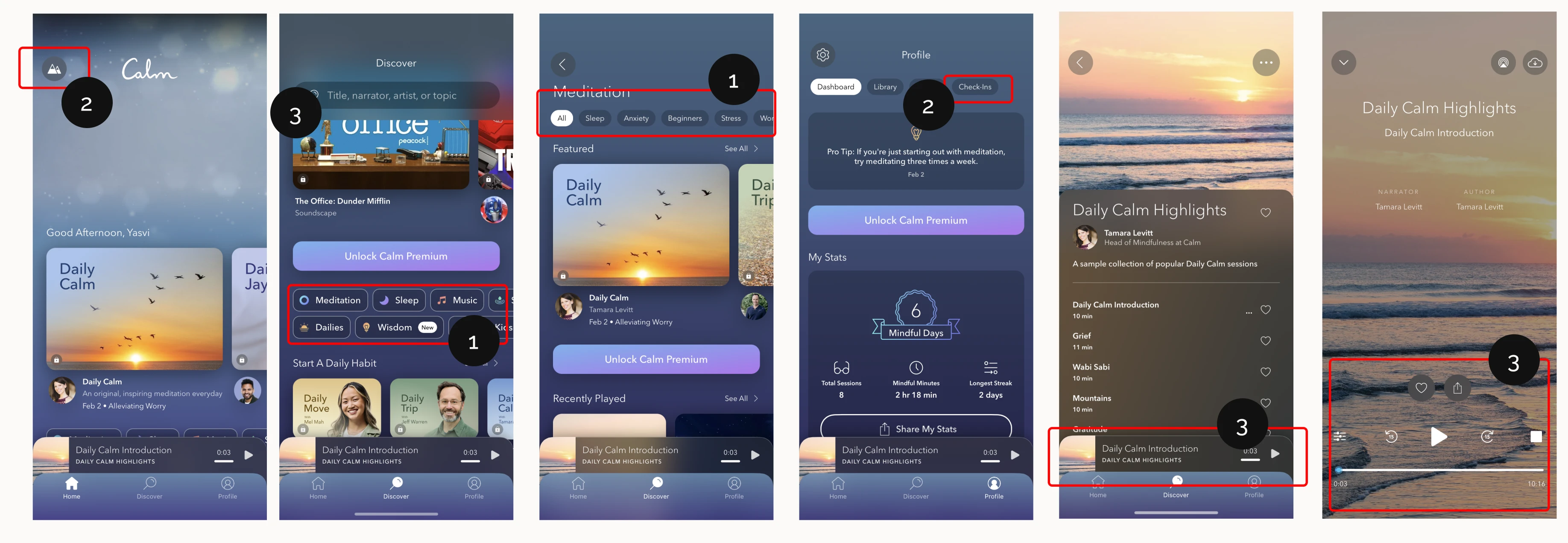

Inconsistent, clunky navigation

Hard-to-reach/unintuitive features

Overwhelming display
Approach.
To create a peaceful and cohesive user experience to support Calm’s users in their meditation & sleep journey, I focused on two aspects: Information Re-structure and Visual Design.
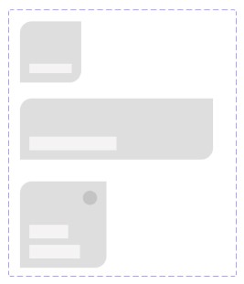
LOW-FIDELITY WIREFRAMES
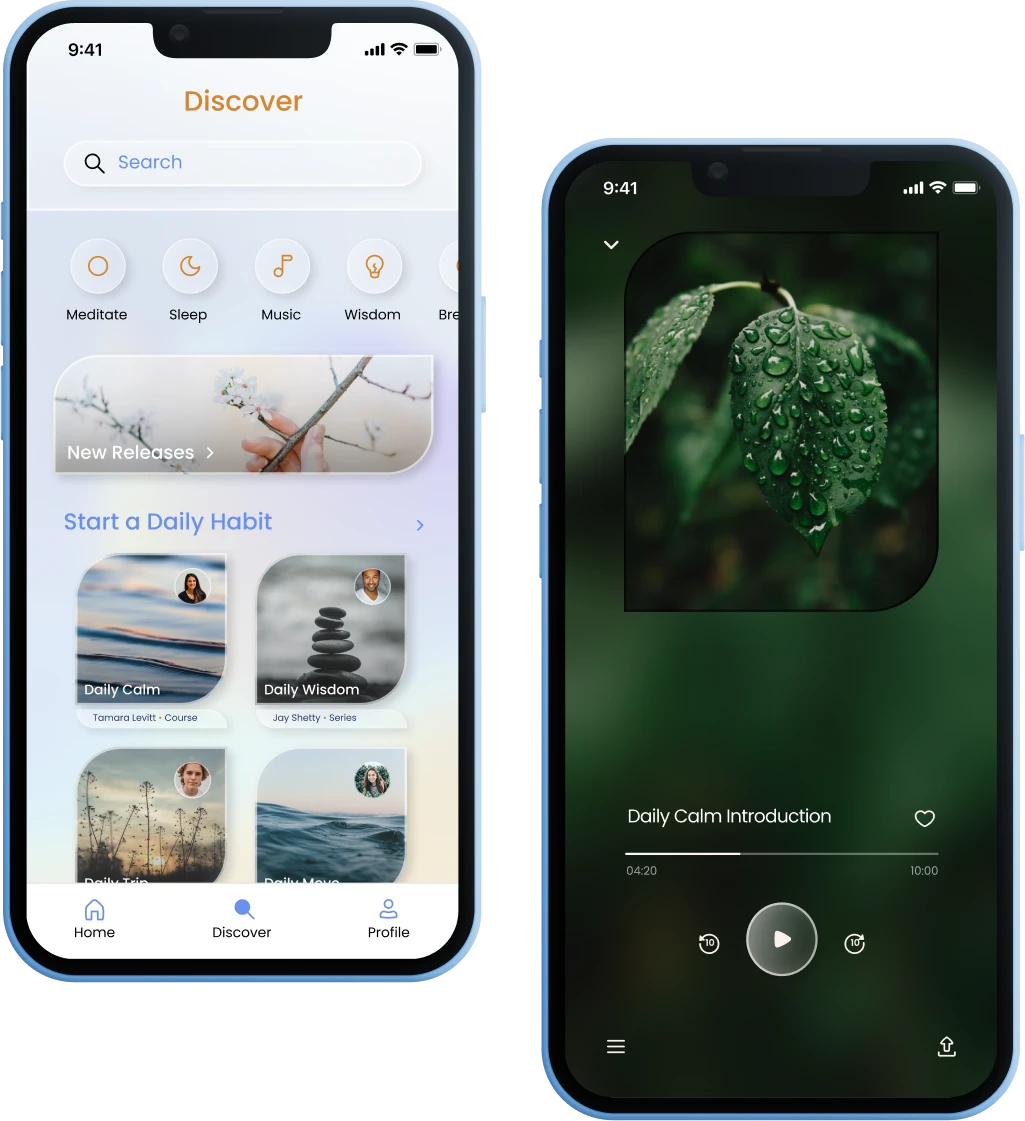
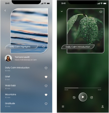
In these low-fidelity wireframes, I leveraged sleek card design shapes and minimal home page and navigation bar to address the issue of information overload and clunky UI. I also worked on building more user agency to improve users’ view of calm’s free trial.
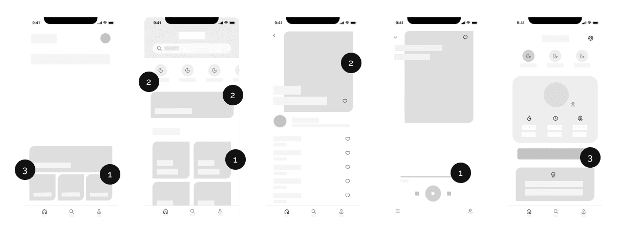
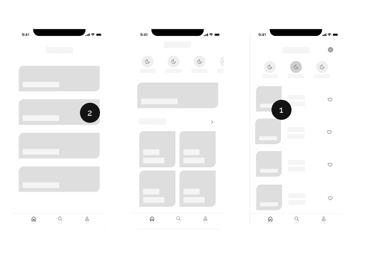
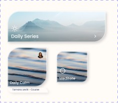
Clean grouping of information
Using gestalt principles of proximity and similarity to present previews for lower cognitive overload without cutting down information.
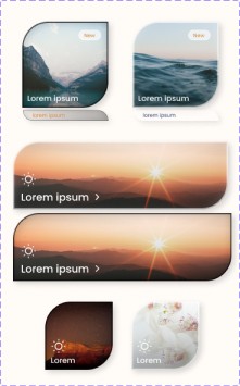
Unique delicate card shapes
Creating delicate card shapes for large, medium & small card buttons and a sleek discover menu. This creates a consistent experience.
Removing redundant information
Removing redundant access to the discover page and "unlock premium" button to promote more user agency and allow exploration.
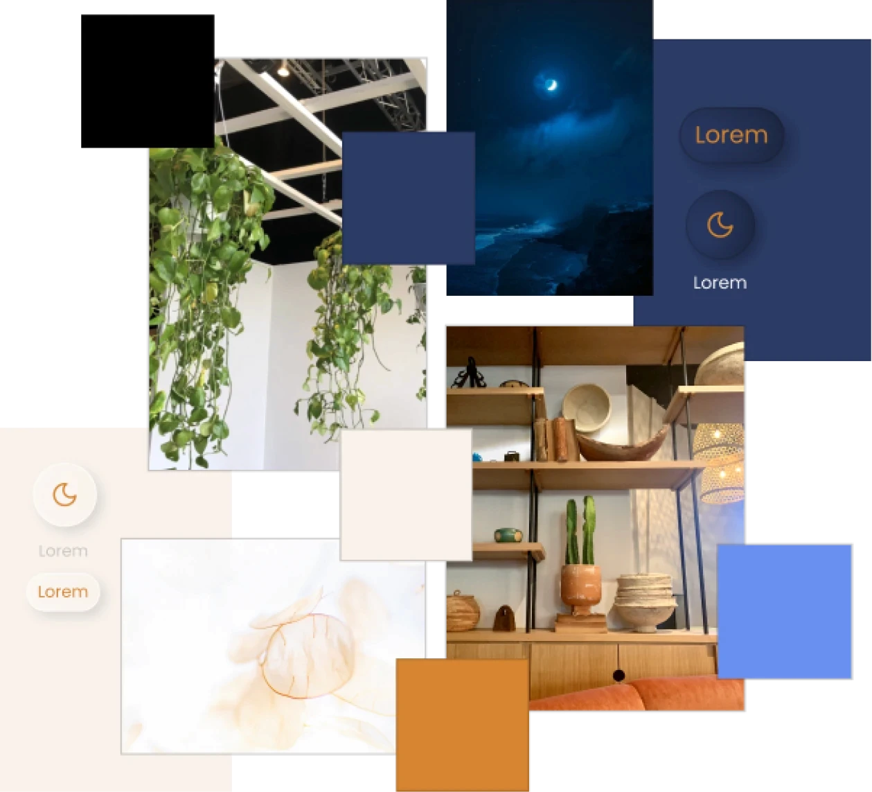
CREATING AN ETHEREAL FEEL
I created a mood board using photos from my trip to the Wonder Space Museum in Philadelphia and a few ethereal photos from Unsplash. I then intuitively chose complementary colors and finalized them using WCAG contrast ratios. The final pallet incorporates the bright colors of meditation and happiness as well as the dark colors for sleep and calm nights.
I also used the same mood board to design card shapes that resemble leaves and choose glass morphism effects for the buttons. For text, I chose Poppins as my main font to add structure to the overall delicate aesthetic.
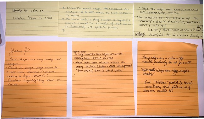
ITERATIONS
After the first critique session (4 critiques), I made the following iterations to create the final card design. I also iterated over my secondary font to create a friendly aesthetic.
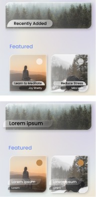
After collecting the feedback from the final critique (15 critiques), I further iterated over the card shapes and implemented the feedback on the home page.
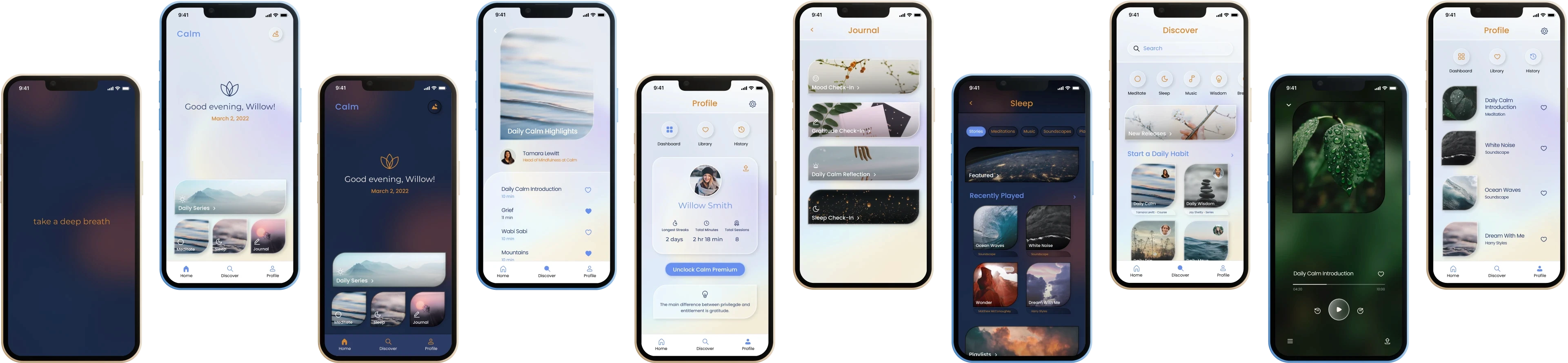
Solution.
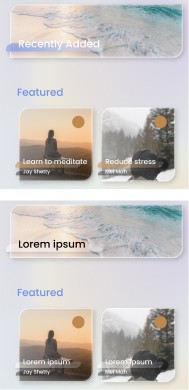
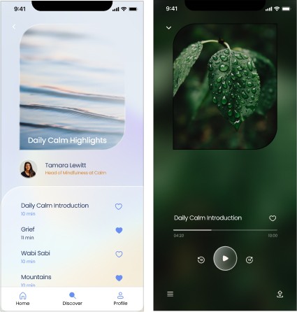
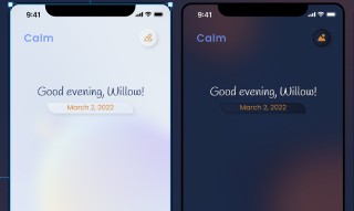
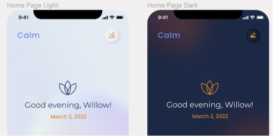
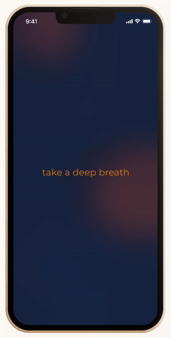
The result of the above approach was an ethereal user interface and a consistent design system that adds to the user's meditation and sleep journey. The relaxing splash screen ensures that the user has a positive experience from the moment they open the app. The dark mode provides a dynamic experience for users who want to use the app to aid their sleep.
Since most of the content is locked anyway, I removed the redundant unlock premium buttons and increased the visibility of the limited free content on the discover page. This would provide my agency to the users of free trial and improve their experience making them more likely to spend on the premium version.
RELAXING FIRST IMPRESSION + DARK MODE

reduced clutter and ethereal USER INTERFACE
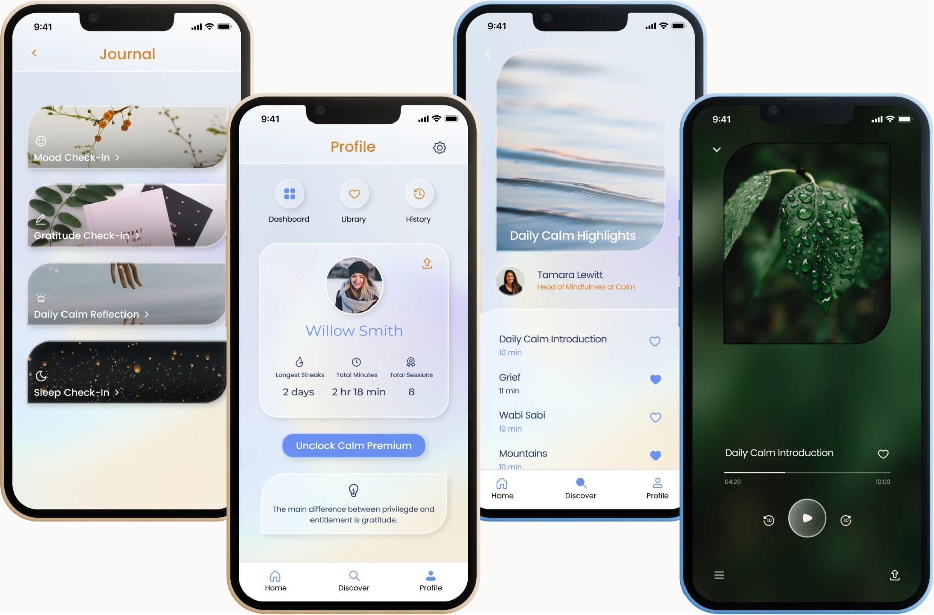
clean & consistent design system
Reflection.
Since this was a personal project, I was unaware of the business constraints affecting the current user interface design. One way that I handled this shortcoming was by focusing heavily on the user's experience. I researched online reviews, did a heuristic evaluation, and compared the app's experience with the competitors like Headspace and Journey. Additionally, having weekly design critiques with developers, UX researchers, and designers to rationalize and at times defend my design decisions helped me to maintain a realistic, user-friendly, and calm user interface.
In retrospect…
I would try reaching out to the folks in UX communities that have worked in a similar space to better understand the business constraints of a health and wellness app.